Pulsar Patch
Pulsar is a company fighting hangovers with a topical patch you put on before you drink. No pills, no powders, no B.S. I led the build of the entire brand alongside the team: the voice and archetypes, the style guide, the packaging that put it on shelves, and the campaign that keeps it there. What follows is the whole story. What it is, why it matters, and how it became a brand.
- Client
- Pulsar Patch
- Year
- 2025
- What I did
- Strategy & voice · Brand identity · Style guide · Packaging · Apparel · Campaign · Web
The Numbers
From zero shelves to a growing retail footprint, in bars, liquor stores, and smoke shops.
Section One · The Voice
Built on archetypes.
01 · The Idea
What they are, and why they matter
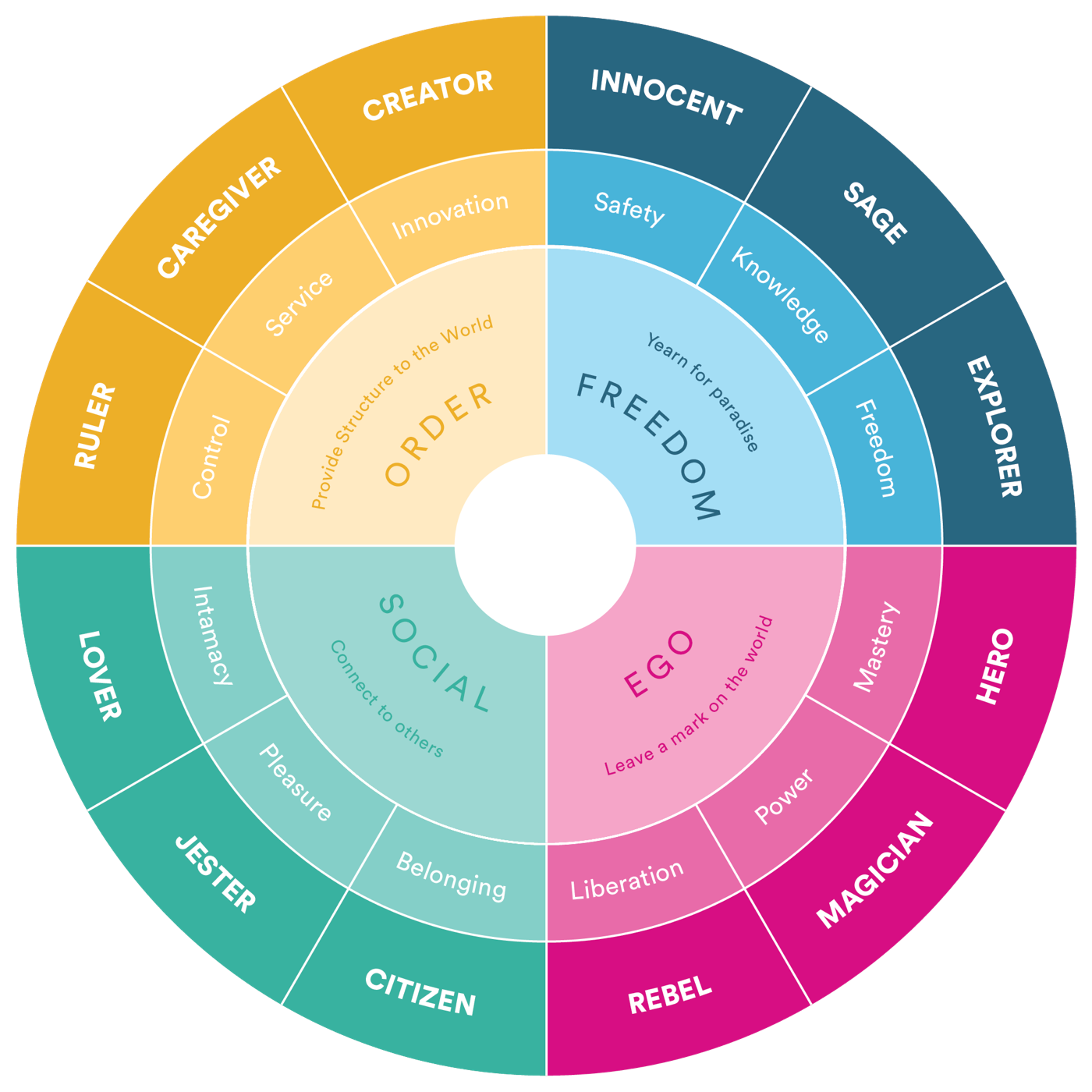
Every strong brand behaves like a character. Archetypes are twelve of them, universal personalities, rooted in Jung, that people recognize on sight. Choosing one gives a brand a consistent way to speak, look, and act, so every decision points the same direction instead of getting reinvented each time.
The wheel maps all twelve around four core motivations: Order, Freedom, Social, and Ego. Where a brand sits is where its personality begins.
02 · The Choice
Pulsar’s two
Pulsar runs on two: a Jester as its prime, and a Rebel underneath. The fun and the spine, working together.
Jester
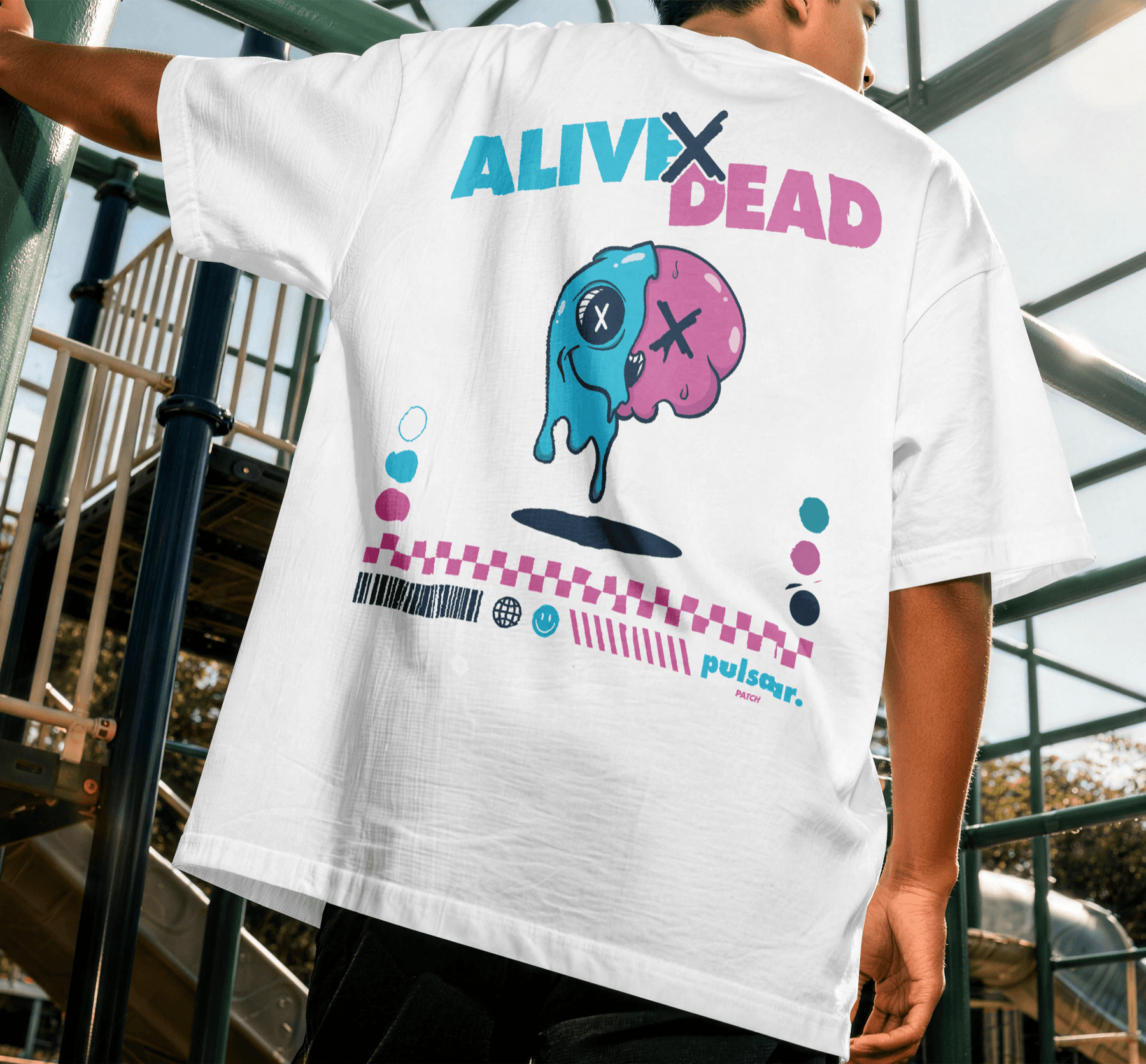
Here for a good time and the morning after. Short, confident, and funny, but never at the customer's expense. It's the voice that makes Pulsar worth keeping around.
Irreverent / Clever / Honest / Playful / Approachable
Rebel
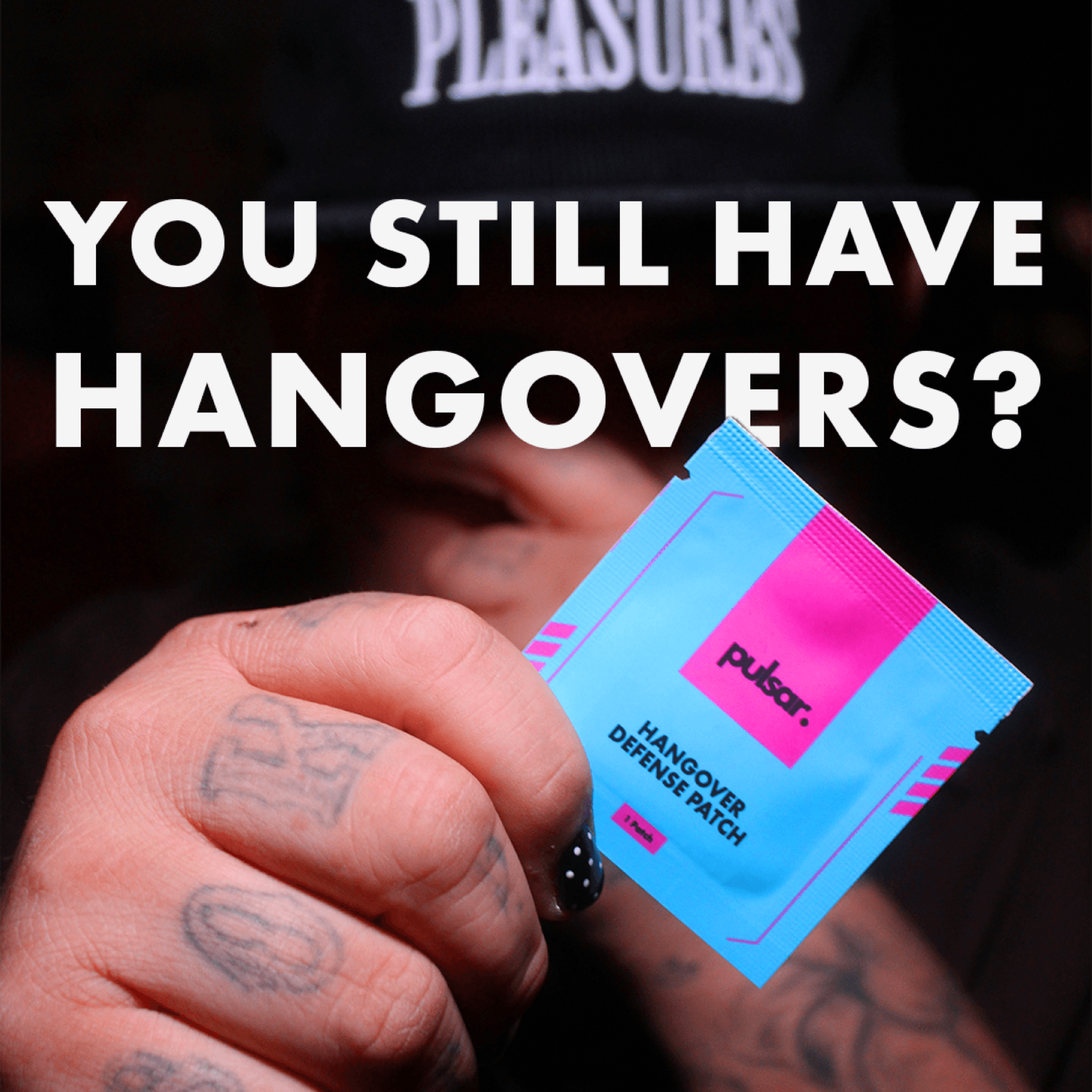
Defines itself against the broken stuff: the “drink responsibly” lecture and the supplement-aisle snake oil. It's the voice that earns belief by refusing to overclaim.
Bold / Rebellious / Disruptive / Unapologetic / Unfiltered
A Rebel to the people who don’t believe it yet, a Jester to everyone who does.
Logo & Marks
The Logo
The mark had the same problem the brand did. It was closed off, doing too little with too much. So we opened it up: gave the wordmark room to breathe, drew it back to its bones, and let the color come through. Same logo. It just finally gets to shine.
Packaging · The Breakthrough
The Display Can
The biggest problem wasn't design. It was dependence. Retail display used to mean paying a third party to produce it. So we designed a patent-pending display can and 3D-print it ourselves, in-house. It killed the middleman, and it became our single biggest B2B selling point, the thing that gets Pulsar onto the counter.
Assets & Designs · Iconography
The Icon Set
A full custom icon library of simplified, instantly readable marks for ingredients, benefits, and social, so the brand stays self-serve across the team.






Assets & Designs · Campaign & Merch
Out In The World
The brand where people actually meet it: posters and social creative that put the Jester-and-Rebel voice to work, plus the tees, hats, and stickers that turn customers into billboards.
Web Design
The Website
The digital home, the brand system put to work online. Designed and built end-to-end: product storytelling up top, the science underneath, and a store locator that feeds the B2B pipeline.
Sales Collateral
The One-Pagers
The sheets that do the selling when I'm not in the room: the distribution opportunity, the liquor-store pitch, and the staff quick-guide. Same voice, tuned for a buyer instead of a drinker.
The System
Brand Guidelines
Everything above answers to this book. Logo construction, palette, type, voice, and usage rules. The single source of truth that keeps Pulsar the same brand from a shelf in a smoke shop to a story on a phone.
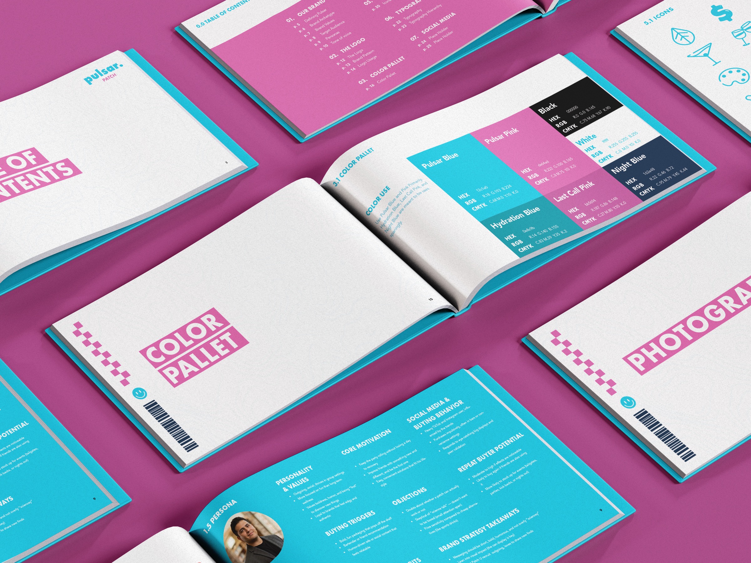
Read the Whole Book
Swipe, or tap a side of the page, to turn it.
Read the Whole Book
Click a page, or use the arrow keys, to turn it.
We're not just a patch. We're a strike against regret.